Quite often, after you have received the printed copies of your book, you will notice that the colours in it (or on the cover) are quite different from those you saw on the screen while the book was being developed. This is because the colour schemes used in each case – the computer screen and the printer’s ink – are vastly different in their composition and, consequently, appearance.
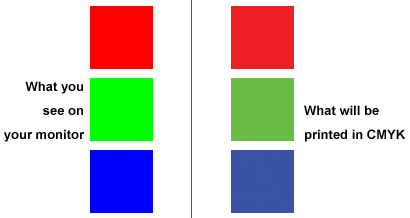
The two colour schemes are RGB (Red, Green and Blue), used for depicting colour on the computer screen (the pixels have little subpixels that just show red, green or blue in different ‘doses’), and CMYK (Cyan, Magenta, Yellow and Black; the K actually stands for key, which was what the black colour denoted), a combination of ink amounts that produces a certain colour.
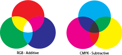
A little more technical detail for those who might care: RGB colours are also known as “additive colour”, because there are no colours to begin with, and the colours are added together to achieve further colour combinations, or until the outcome is white. On the other hand, CMYK colours are subtractive – it starts with all colours (which combine to form black) and as colours are subtracted incrementally, the outcome gradually veers towards white.
What must be noted is that the colour gamut in case of the RGB palette is a much larger one when compared to the CMYK palette. Care must be therefore taken to ensure that, while designing printed material, the CMYK palette is used so that printing can actually happen with the right colours. In most software, the default mode is RGB, so if you are designing a printed brochure, for example, you must ensure that you switch to the CMYK colour palette.
So, rule of thumb: CMYK for print jobs, and RGB for web-based graphics.